So it looks like the dawn of the playable ad unit on mobile is upon us. It’s been hyped for a while and they are popping up in games with increasing frequency. They’ve got a long way to go to be an effective, honest form of advertisement, though.
What are they?
They are interactive interstitial ads that pop-up, much like a video ad would, and ask the player to engage with the ad. The player then engages with the ad, usually by tapping. The idea is that since the player is engaging with the ad unit, they are more likely to be interested in the game and perhaps will download the app being advertised.
So far as I’ve seen, the implementation has been severely lacking. Some are better than others, let’s take a look.
Game of War

This first one is an ad for Game of War. You are told to tap where you want to shoot. Your character is in the middle of the screen and enemies approach from various directions. Tapping dispenses them easily. After tapping for a bit, a flash of an end screen seems to appear, but, since you’ve been tapping, you are taken directly to the App Store. FAIL.
After a timer counts down in the upper right, an “x” appears to close out of the experience, which is some consolation. But otherwise, this is a terrible, terrible implementation of an ad.
Mobile Strike
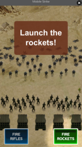
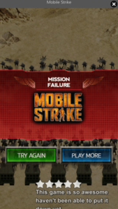
Next up, is an ad for Mobile Strike. This one is slightly better as it doesn’t ask you to tap as much. You are faced with oncoming hordes of military foes and exhorted to “fire rifles” and “fire rockets” to fend them off. After a countdown timer, there is also an “x” to close and I actually got to see the end screen this time as I wasn’t tapping like a maniac.
Game of War #2

The next one is for Game of War (do you see a trend?) and the playable ad gives players the chance to guide a flying dragon. The dragon auto-fires as you collect power ups and destroy on-screen targets.
This was the most “game feeling” one of the bunch (perhaps because it’s farthest away from typical MZ gameplay) — there was a bit of agency with the controls and nabbing of power-ups. Same “x” appears as in other ads.
This also was the “friendliest” of the bunch as it would more difficult to tap through straight to the App Store.
Mobile Strike #2
The last one I’ve seen is a tap tap tap one featuring helicopters you are supposed to target quickly. It, too, led directly to the App Store owing to the excessive tapping.

Final thoughts
For these ads to be successful, a lot of work needs to be done to make them more player-friendly and honest.
- Feature something that at least approximates accurate gameplay. This seems to be standard operating procedure for MZ’s advertising though, so perhaps it’s unavoidable in these cases. I strongly believe actual representative gameplay would be more effective in capturing high quality players.
- Give the unit a timer that counts down the gameplay so the player stops tapping and has a chance to see the end screen. Then they can OPT IN to visit the App Store. Getting them tapping and then funneling them to the App Store is deceitful.
I have heard anecdotally that these ad units have some technical challenges (crashing apps, etc), so I expect there are still kinks to be ironed out. I hope that as they solve the technical challenges, they will also address the poor player experience as well.
What playable ads are you seeing? Are they better/worse? Let me know!

