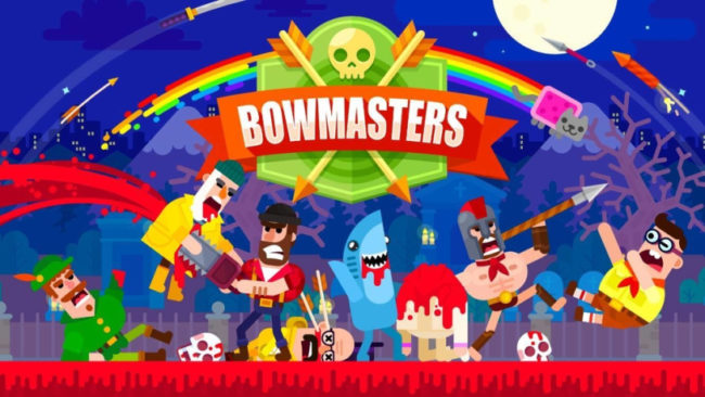
This is a review of the recently featured (iOS) game, Bowmasters – not to be confused with Bowmaster, which is a totally different game. And certainly not to be confused with Bowflex.
It’s benefitted from the Apple spotlight, cracking into the top 20 US download charts. On the grossing side, it hasn’t fared as well, which is not abnormal for casual games of this ilk. Without sustained spend, I expect the chart position to drop even more once the featuring organic windfall is over.
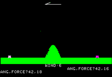
Essentially, the game is an updated version of the classic PC game Artillery, except that it ultimately fails to be as compelling (despite decades of available graphical enhancements).
What’s Good
There are things I do like about the game — the production values are good: the characters are charming and it’s got some nice cartoony Mortal Kombat-style gore sequences (to include ripping off round-ending fatalities).
Mobile affordances
The mechanic is simple and well suited for mobile: simply swipe back, aim and release. It’s nice that there are a variety of characters with slightly different mechanics to attempt to spice things up a bit.
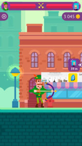
I also like that the game can be played either landscape or portrait. It’s nice to know I can open and play it one-handed when in line at the grocery store. Though it should be noted the apple mode plays in landscape only. Weird.
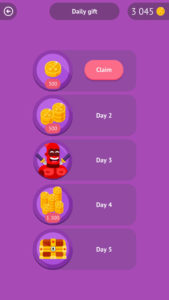
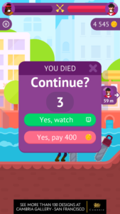
It also has the usual features you would expect to see in a Free-to-Play game: reward/roulette chests that you can unlock with currency (or a video ad), daily returning bonus, spend coins or watch video to continue, first time player starter pack.
What Needs Work
The gameplay gets a bit dull and the difficulty curve can be punishing, leading a player to want to bail well before getting a chance to settle into the game. Which is too bad, as there are several modes that seem to lend more variety. It’s a bit inscrutable as the content is locked with little indication about what might actually lurk there.
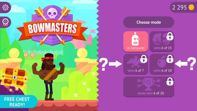
What I guessed was online multiplayer being unlocked at 15 wins was a less exciting “pass and play” with a friend mode. The bird mode is shooting birds and the apple mode is a William Tell-style apple mode. But the game should do a better job to show why I should stick around. Offering at least one more mode at the outset, or ensuring the player unlocks it in the first session would be a much better experience. At the very least, show a “tap tip” when a player taps on locked content.
Difficulty
The game gets hard really quickly, which is frustrating. You have to remember what you last threw (angle and strength) or basically start all over again. After five wins, the computer seems to hit you pretty much immediately, so you are hoping to hone in before they finish you. In the tutorial, there’s a guide that shows you the right path to take. It would be very simple to show the player their last throw to make it easier to zero in on your enemy. This could even be a consumable (with coins) or a power a certain character has. Note: perhaps a character does have this, I couldn’t tell as the game does a bad job showing what each character does (see below).
What am I buying?
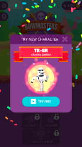
There are a bunch of characters and the game does a decent job introducing you to the spend loop by guiding you to buy a new character. However, it’s not explained why I would want to do this. There are achievements to be had, sure, but do certain characters give me an advantage against others? It would be great to communicate that and to let players see what they would be getting for their hard-earned coins. At the very least, show an animation of their attack so players understand how the character might be different. I have noticed they added a “try new character” feature in which you can play a character after watching a video ad. That’s a step in the right direction.
Advertising spam
Monetization is hard. So is retaining players. Push too hard in one direction and you will likely suffer in the other. Though Bowmasters does a good job allowing players to benefit from viewing ads — there is a nice value exchange for opening chests and continuing a game after losing– it completely goes overboard with ads frequency. There is no cap on display of ads — every time you pop in and out of a menu, you get an ad.
This game is the first time I’ve experienced an interactive ad in mobile. It was neat to encounter, but the execution was terrible. I don’t blame Bowmasters for this, but I’m not sure other players will be as forgiving. The ad was for a well-known company that advertises a lot – let’s call them Racine Bone. You are presented the ad and then told to tap. You tap dutifully on the ad and then the ad switches to the end screen. Of course, since you are tapping, you are immediately taken out of the game and to the App Store. Terrible.
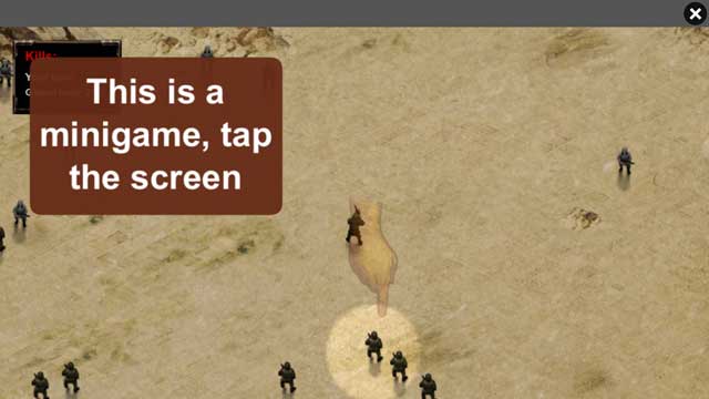
While I did like being able to play in portrait mode, I also encountered some glitches in ad implementation (see below).
Side note — it’s annoying to get asked for notifications right after you’ve tapped on a chest and before you see what’s inside. You don’t want to detract from that positive player experience by asking for an opt-in. Better to let them discover the delight of the chest and then tell them they can be reminded when another cool chest is available.
Conclusions
Bowmasters comes in a nice package and they do a reasonably good job introducing the core loop (play and spend). I would guess they are making decent money on ads, but the ad frequency is way too high. Suggestions for improvement:
- Have a cap on ads to ensure players don’t get fed up and ensure the interactive ad unit isn’t such a terrible experience.
- To combat gameplay getting stale, open up modes sooner and advertise the value of new characters by showcasing their specials more prominently.
- Add a challenge mode to send challenges to friends to increase virality.
- Consider taking a page out of Artillery’s book and add wind or other changing variables/obstacles.
